
What sells a book? The simplest answer is: the cover. Yes, the cover is the first thing a potential customer sees before discovering the content. The first glance is directed at the cover: its style, its colors. Only then does the human mind “read” the title. If the title corresponds well with the cover, it encourages closer inspection of the content. Afterward, people move on to the book's description, reviews, and ratings found online.
In this article, we’ll help you with the technical aspects of a cover. While a buyer may not be familiar with these aspects, they will notice if a cover appears “blurry,” which could discourage them from purchasing your ebook. That’s why the technical details are so important. In the article “What Sells a Book? Colors and Images,” you’ll learn how to design an interesting, intriguing cover for your ebook. You’ll discover what colors mean and which fonts to use or avoid. In another article, “The Best Tools for Cover Design,” you’ll find out which tools are worth using if you don’t want to rely on a professional graphic designer. This information can also be applied to designing covers for printed books. Remember, the first impression a book cover makes on a reader could be... the last one. Either it encourages them to read the description—and ultimately buy—or they’ll skip your ebook. And we wouldn’t want that, would we?

Technical requirements matter. However, they can differ slightly depending on the platform where you want to publish your ebook (and its cover). These differences are also influenced by the devices readers use and the software that supports ebooks.
Format and Size
Depending on the platform where you publish your ebook cover, you’ll find slightly different parameters. The vast majority of platforms use a size of 15.24 x 22.86 cm. The proportions then come out to 1:1.5 (although 1:1.16 ratios also occur). The most common formats for publishing covers are .jpg, .jpeg, and .png.

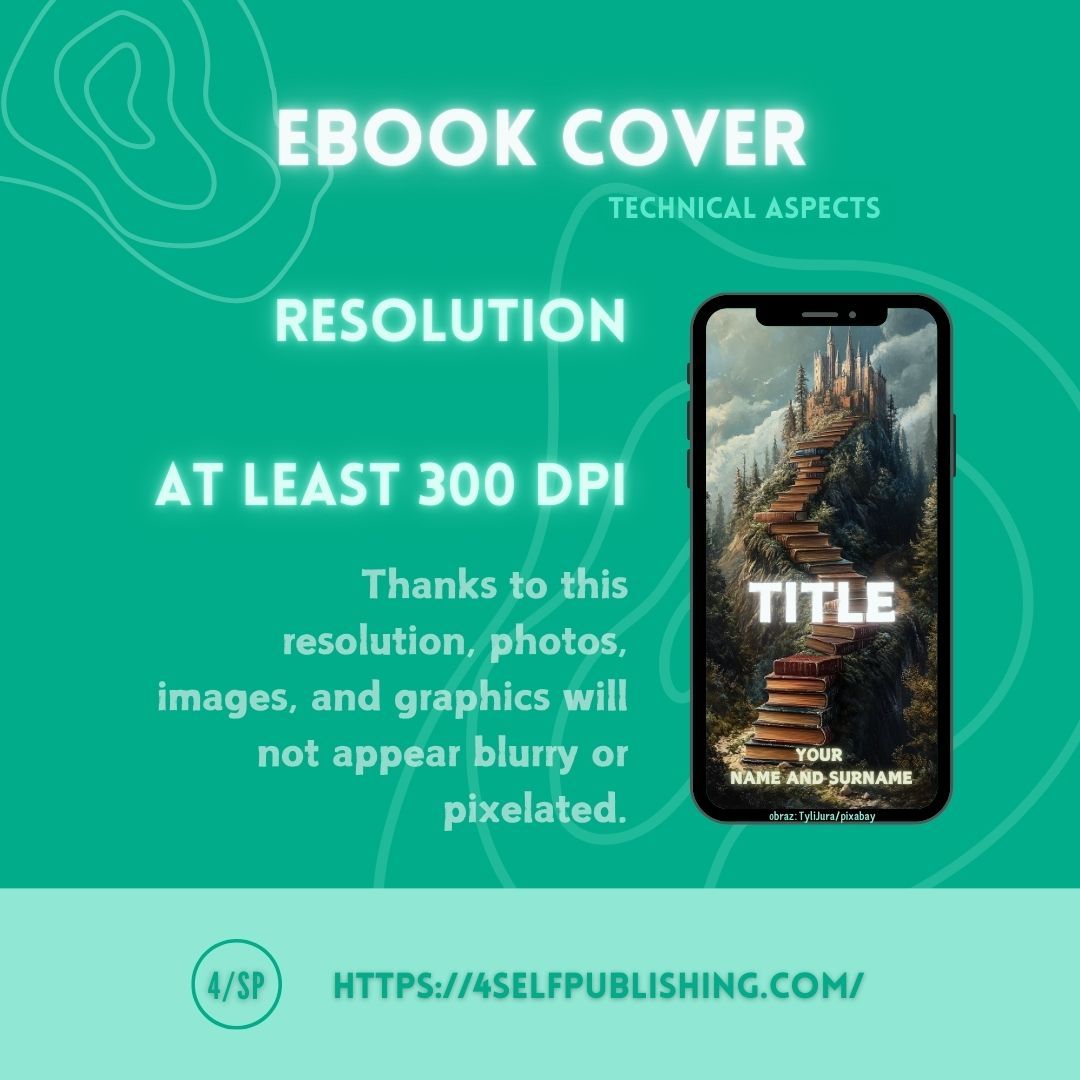
Resolution
A cover, like the internal content of an ebook, must meet certain technical requirements. The minimum resolution of the finished cover should be 300 DPI. In the midst of your graphic design work, don’t forget that the images, photos, or various graphics used in your design must also have an appropriate resolution at the project stage. Otherwise, despite a good resolution for the entire project, it may turn out that the images are blurry or pixelated.
RGB and CMYK Colors
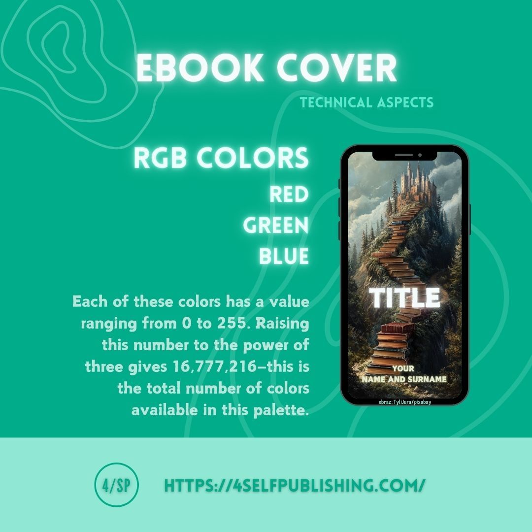
When it comes to colors, remember that your project and the final cover should be created in RGB colors (red, green, blue). Each of these colors has a value ranging from 0 to 255. Raising this number to the power of three gives a value of 16,777,216—that’s how many colors are available in this palette. Black is achieved by applying the lowest ranges of these three colors, while white results from applying their highest ranges. RGB colors are used by electronic devices. On the other hand, CMYK colors (cyan, magenta, yellow, black) are used for printed projects. The CMYK color palette is smaller than RGB. Mixing the first three CMYK colors can produce a color close to black. These differences are worth remembering, especially if you’re designing your ebook cover yourself.
Summary
When designing your ebook cover, keep the following in mind:
- format;
- size;
- resolution;
- colors. These are the basic technical data that will help you publish on most platforms without any issues.